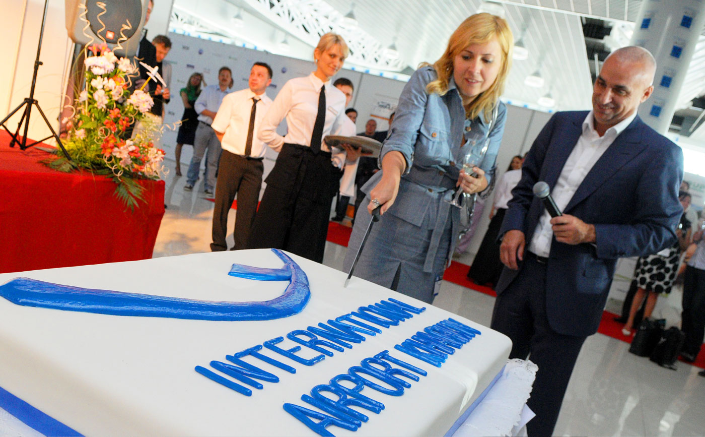
Rebranding of the International Airport
Kharkiv Airport is the largest and most modern air gateway in eastern Ukraine. The reconstruction of the airport was timed and performed in the lead-up to the final of EURO 2012.
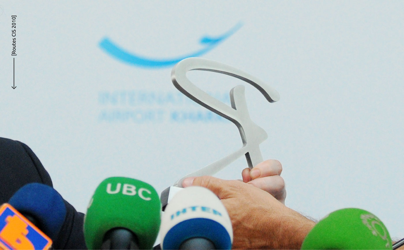
Our task was rebranding caused by two reasons. First, a novel 20,000 sq.m terminal with a new runway was launched. Second: the airport was getting ready to be the first in the CIS to host Routes CIS - a world forum for the air routes development, where airlines and airports from all over the world meet and negotiate. New capabilities required new visualization.
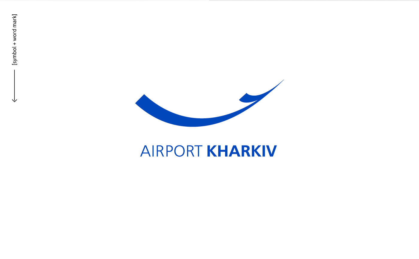
In search of a new visual, we went to the consumers themselves: passengers and travel agents, employees of airports and airlines. The cloud of images and associations that end users have with the airport is reduced to lightness and invisible presence. For girls, this place of arrivals and departures includes emotions. For men, the airport is more associated with a bunch of small issues that should be easily and quickly resolved. At the same time, the logo had to be multicultural, generally understandable and, what is important, it should be easy to integrate into zillions of different applications at the airport. In a laconic feather, someone could see a take-off and blue of the sky, someone - a new vector of development, someone - an unobtrusive high-quality service, and the other one will see an emotion or a smile that the dream airport evokes.
We finalized the perception of the new logo by the Doodle test among the target audience :)


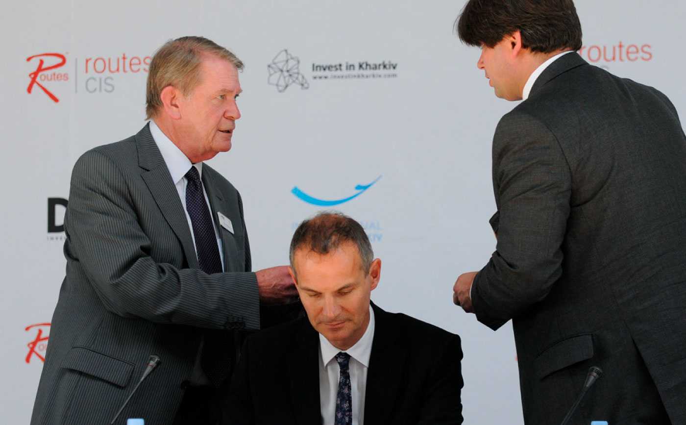
Routes CIS Kharkiv 2010

Doodle Test