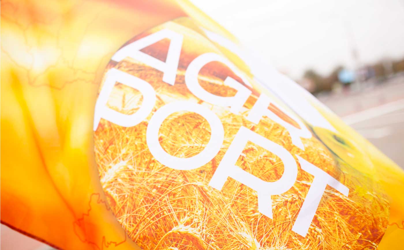
Branding and Campaign of the International Agricultural Forum
AGROPORT is an annual forum for the development of farming. In 2016, it expanded its geography and, uniting the east and west of Ukraine, started taking place in two cities: Lviv and Kharkiv. Traditionally, it takes place at airports. In 2016, the event was held as part of the UN-announced International Year of Pulses.
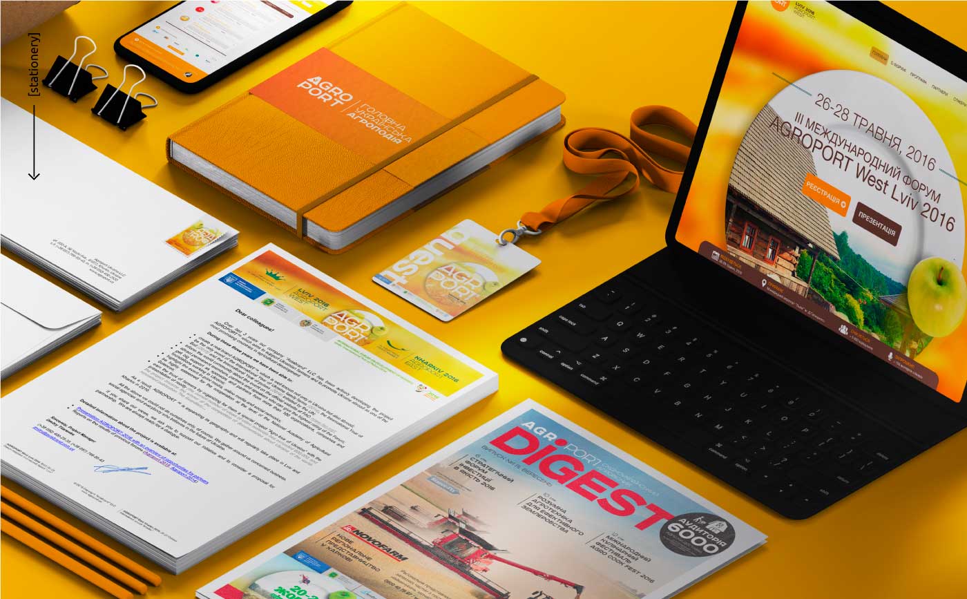
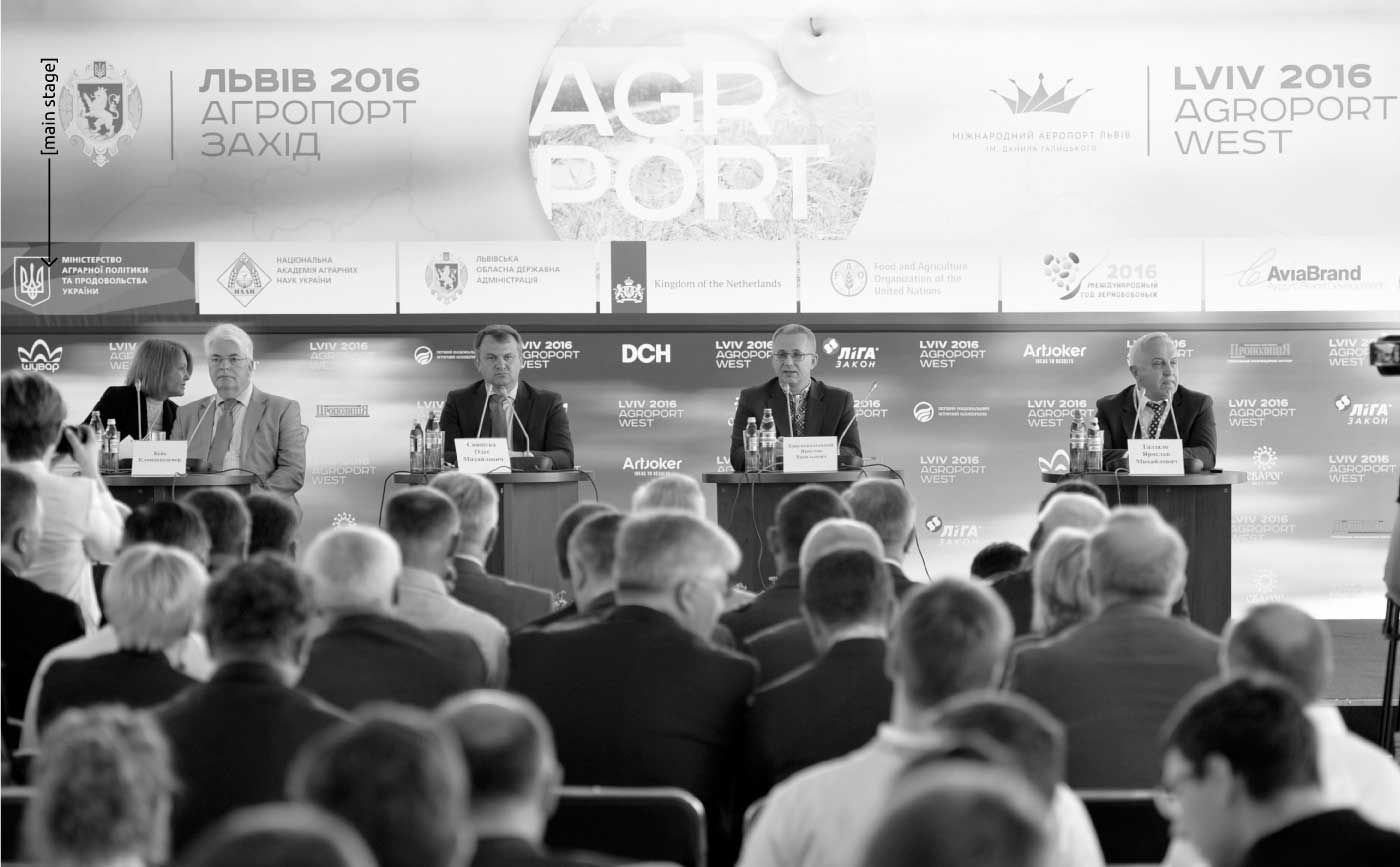
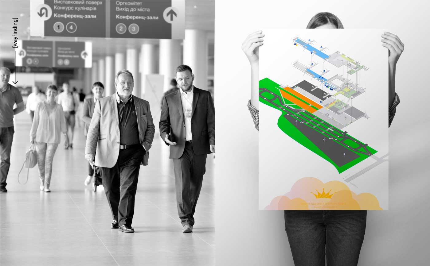
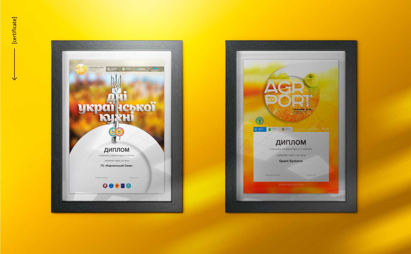
Our task was to brand and create a campaign for all the forum events: advertising in print media, online, creating and making badges, catalogs, programs, materials, and banners for navigation and coordination of people flows, taking into account the unconventional location. Absolutely all the visual images including the design of the halls were elaborated.
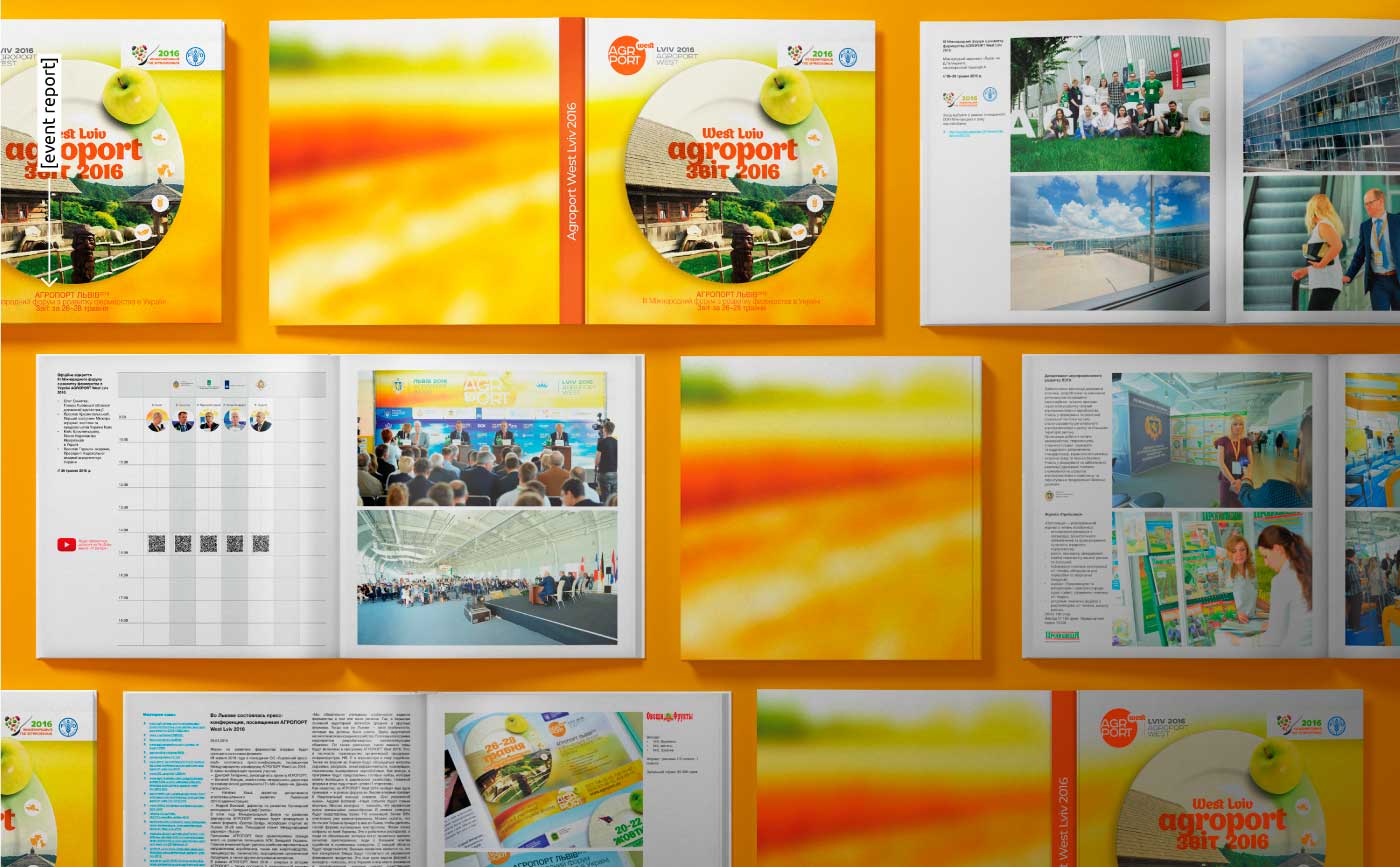
In addition, we had to create a traditional report on the event for the participants and the organizing team in order to analyze and improve the results in the future and work more successfully with participants, sponsors, and partners.
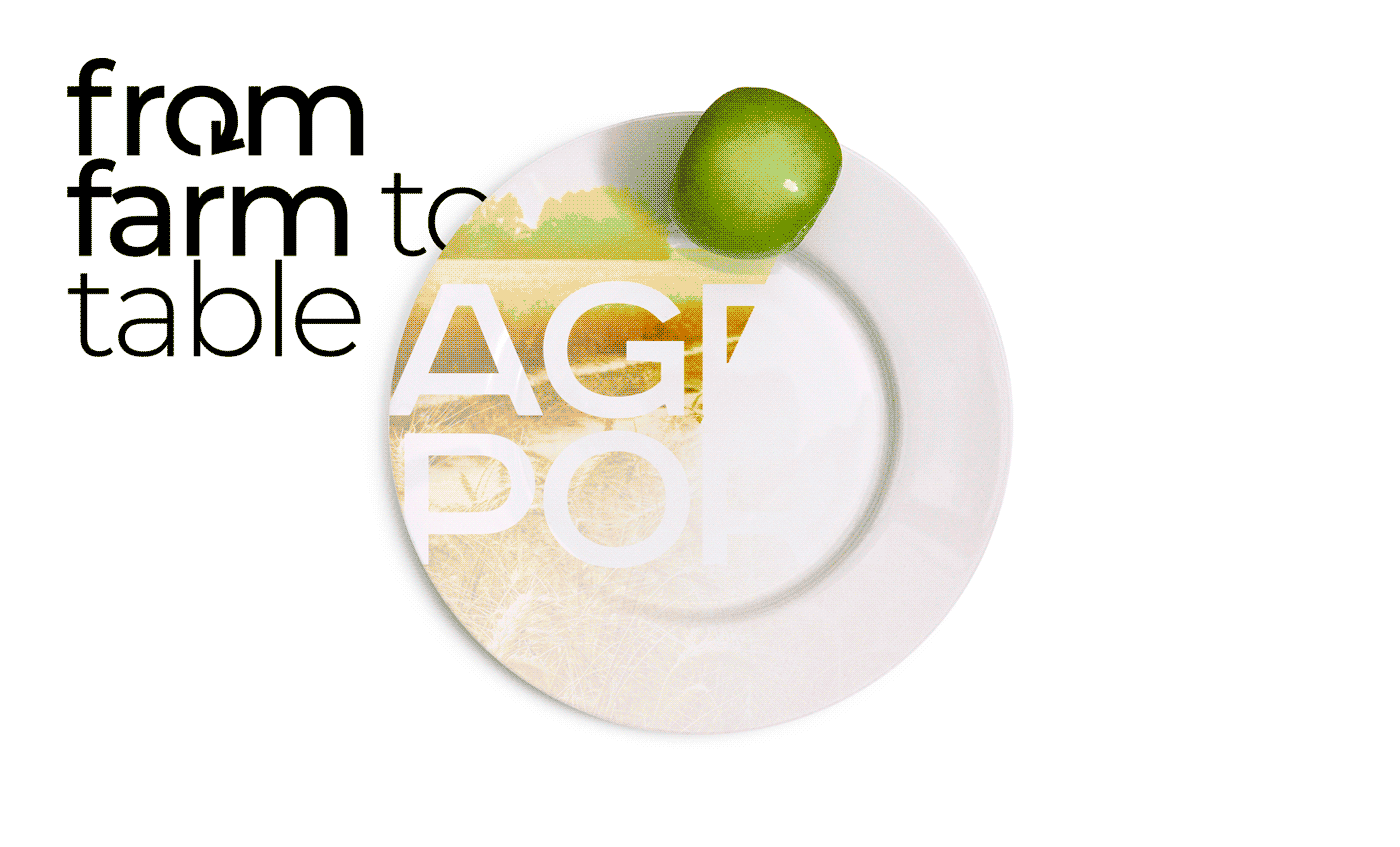
The final implementation of the task had much to do with the forum's strategy to unite regions and create networking opportunities for farmers and culinary specialists. That was AGROPORT 2016 since the slogan "from field to table" has become more relevant than ever. As a result of collaboration with chefs, the festival "Days of Ukrainian Cuisine" was held on the same site, where chefs were cooking using only farm products. The main visual image with a fairytale motive is also in sync with the fact that at the festival one could see how the magic happens, appearing on the tables of the end consumer in the form of a ready product.
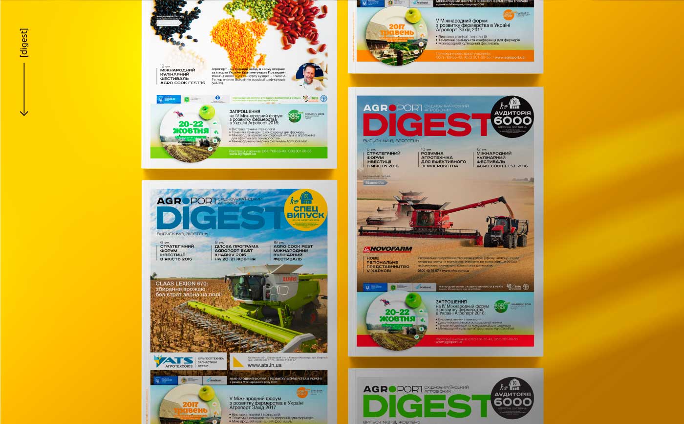
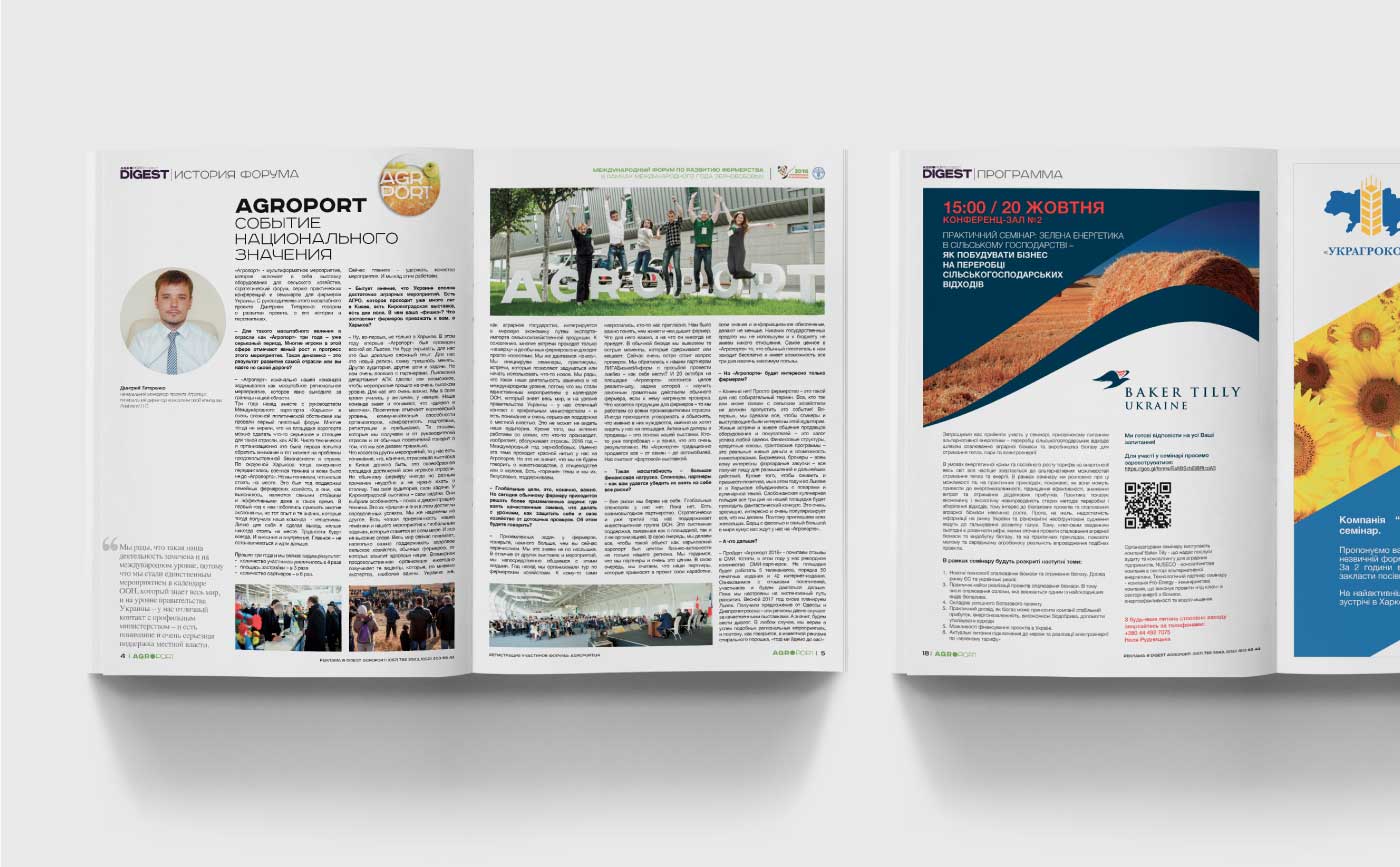
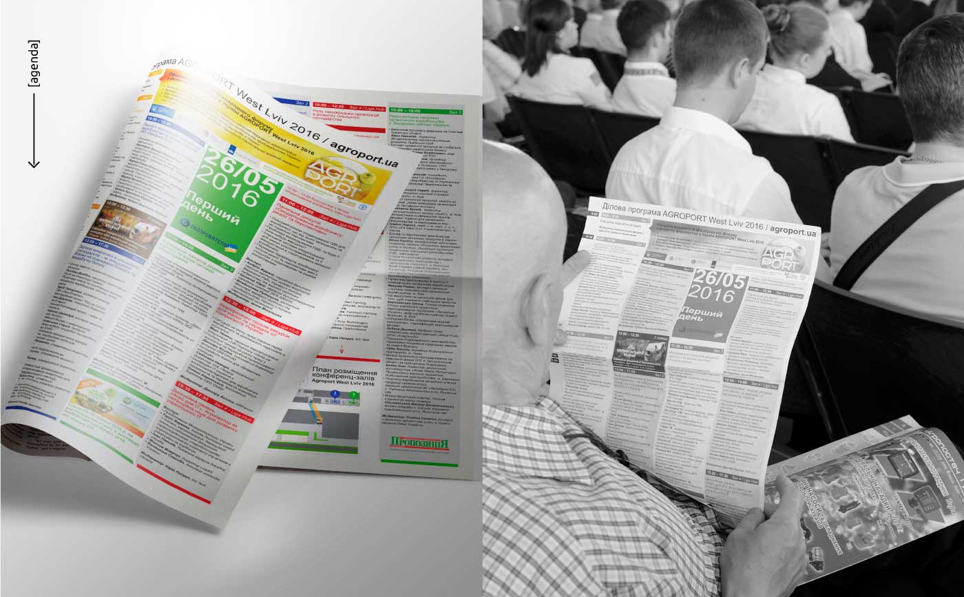
Throughout the entire time of the case management, we were making a lot of experiments with marketing channels and ways of delivering information, and thus we found out that the audience of farmers, which was the most valuable for organizers, is rather conservative. Few of them actively use digital. Therefore, we suggested to the customer that we create their own printed edition. It comprised everything related to the forum. For many people, the digest used to be a guide with the program of events and it also became an additional advertising tool for participants, which was sent to each farm by mail. The first issue paid off even before it went out of print due to the interest of advertisers and participants.