Rebranding of the Design Institute
‘Kharkovprojekt’ has been operating since 1943. It was their architects who developed the iconic public facilities in Kharkiv. The huge list of buildings and complexes of their authorship includes the ‘Sarzhin Yar’ park and the regional sports complex ‘Metallist’. The main direction of the institute's work is the integrated design of the city of Kharkiv, whether it is an idea, a project, or field supervision.
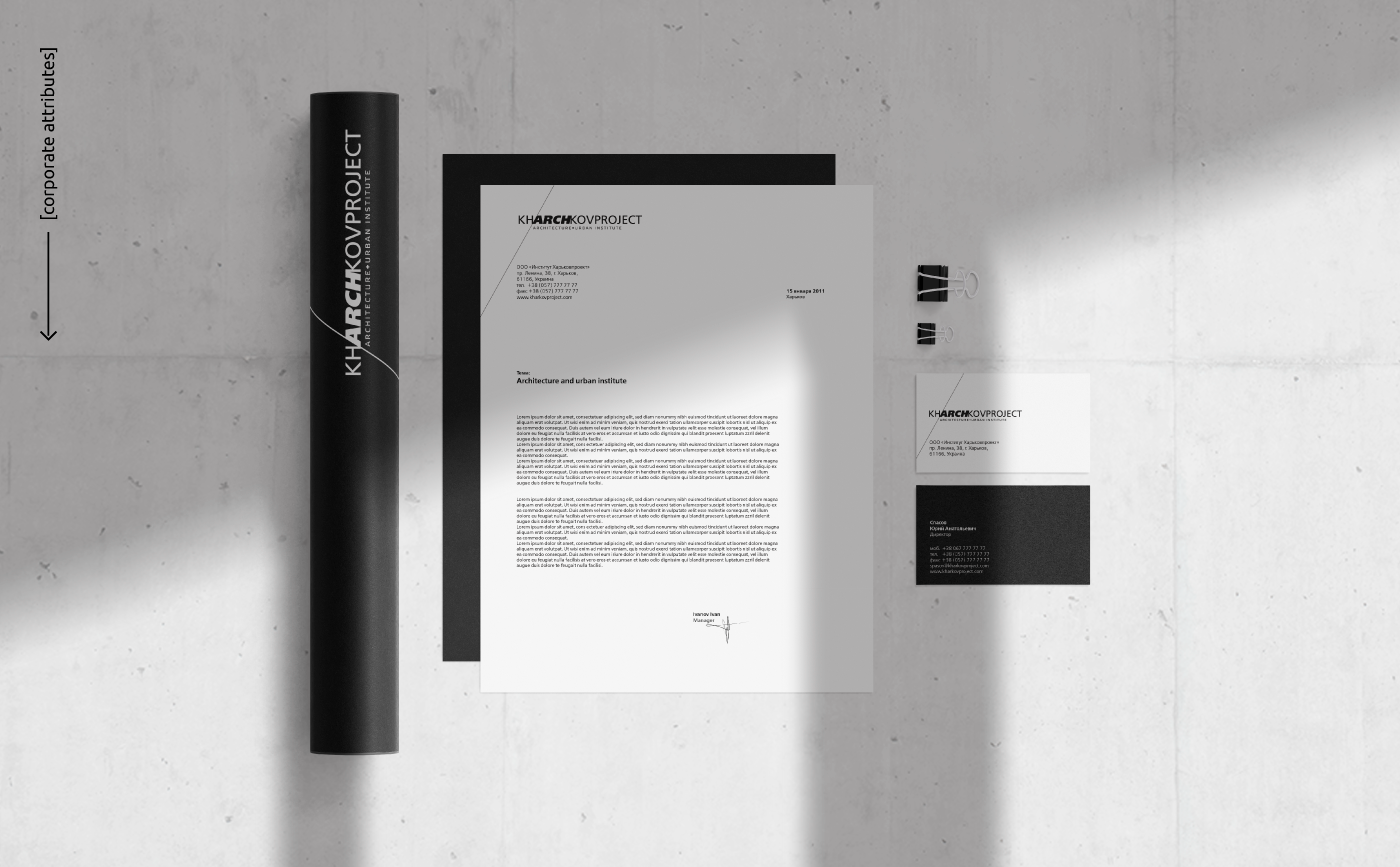
Our task was to rebrand the institute and create an accompanying basic set of stationery: ‘Kharkovprojekt’ was changing its audience and getting ready for a marketing campaign in open markets with foreign partners. We wanted to emphasize the role of the institute in the architecture of Kharkiv. Finding a solution turned out to be a doubly interesting task because our customers were architects with their own design thinking.
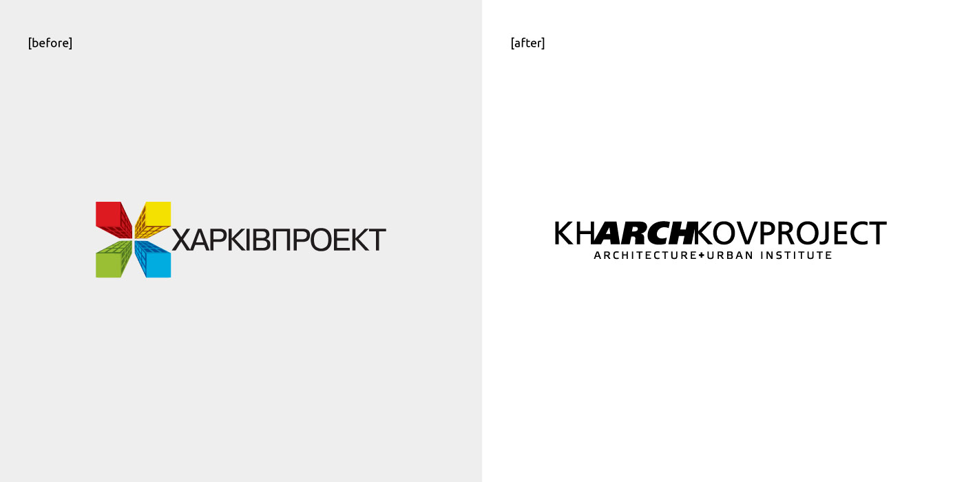
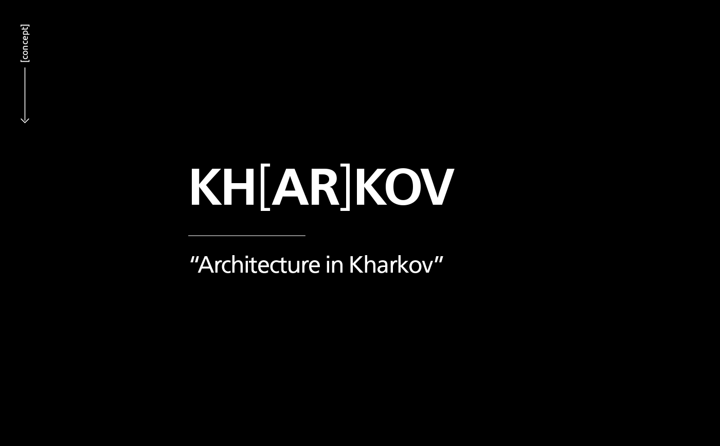
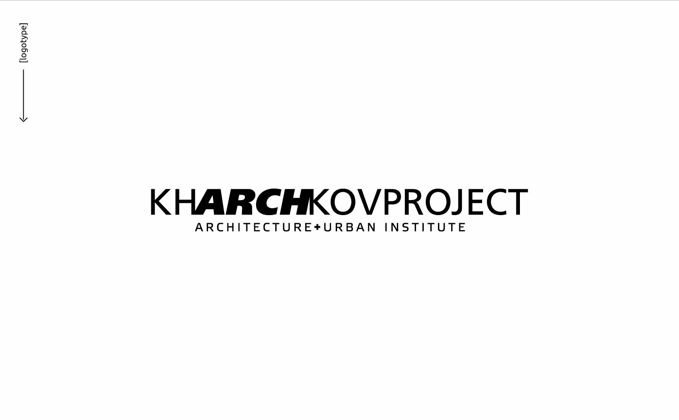
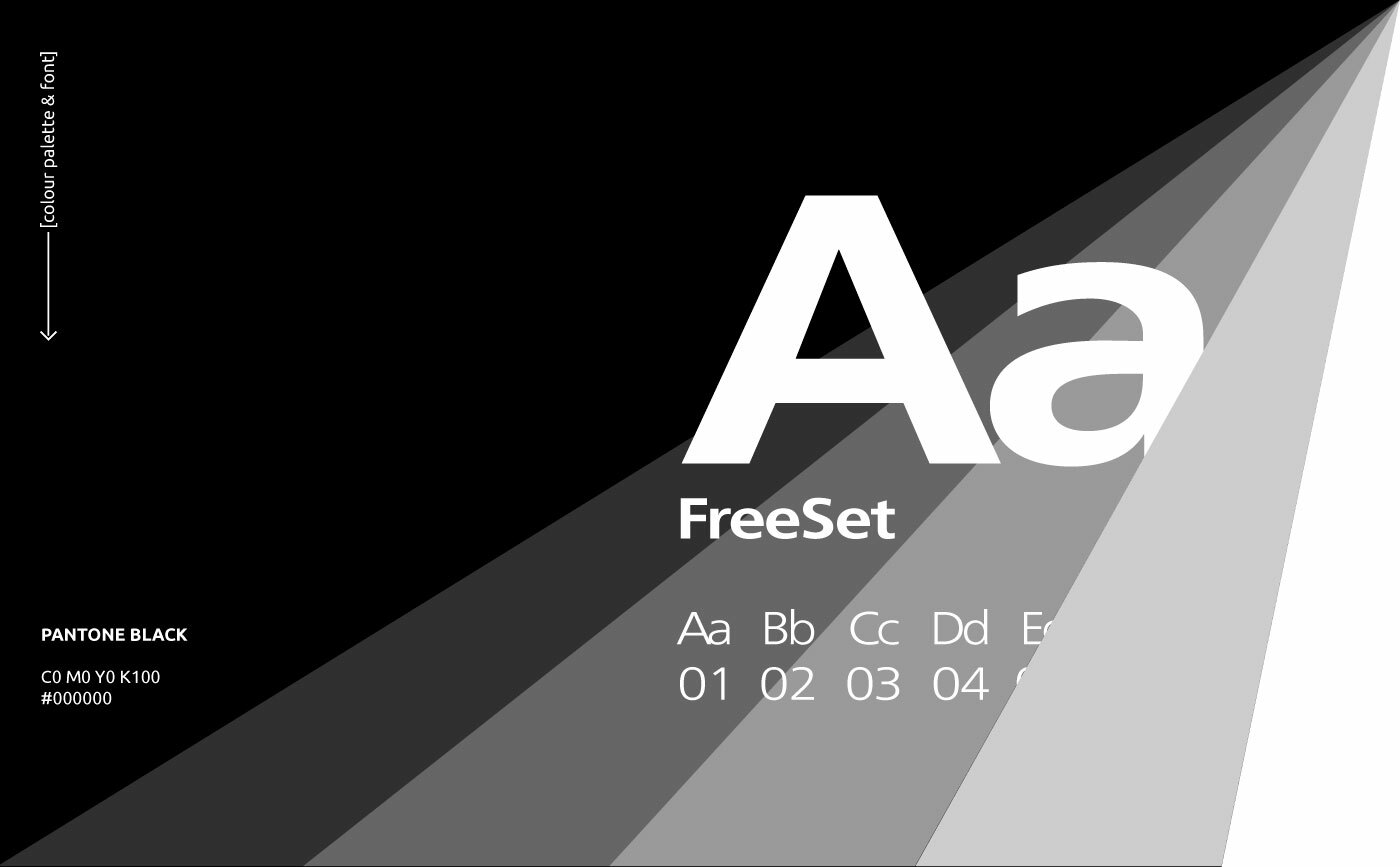
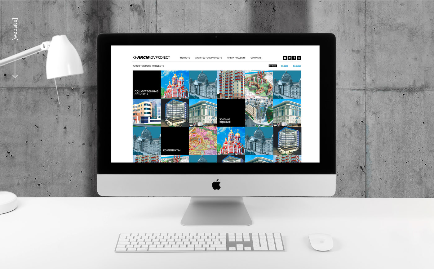
As a result, we got the visualization in a minimalistic design: black and white, typography, and simple geometric shapes, where the institute's projects themselves were graphic elements. The fact that architecture in Kharkiv is associated with the ‘Institute Kharkovprojekt’ is reflected in its logo: the letters ARCH are highlighted inside KHARCHKOVPROJECT.
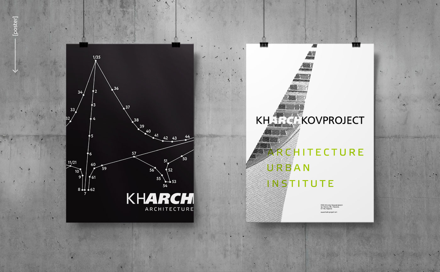
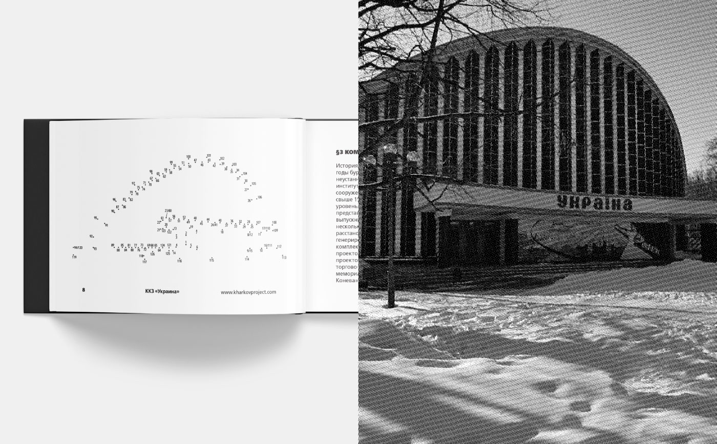
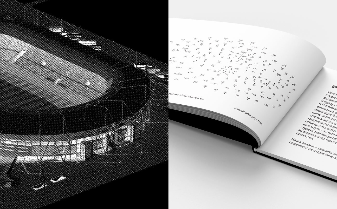
Since the design begins with a white sheet and a pencil, the image booklet is also minimalist, but interactive: to see all the completed projects of the customer, you need to take a pencil and draw them with your own hand by connecting the dots.